

UI/UX | Web & Mobile
Designing Electrum’s
EV Charging Software
2 months, 2022
Timeline
SaaS, web & mobile
Platform
Lead UI design, UX design
My Role
Overview
The project was to overhaul and rebuild from scratch an EV charging SaaS product for Vancouver-based company Electrum Charging Solutions. The product aimed to satisfy the unique needs of different archetypes of customers. Such needs included monitoring EV charging stations in a commercial or residential building, reading charging statistics, and paying for a charging session, among others.
My Role
In this project, I led the UX design and the UI design from start to finish, collaborating with a small cross-functional team of project managers, designers, and developers. I spearheaded the adoption of the Object-Oriented User Experience (OOUX) framework, the creation of the design system, and the execution of the final design deliverables.
Problems
The previous system had several problems. We prioritized three of the most pressing to tackle in the initial phase of the project.
No scalability: The old product was built perhaps too hastily to satisfy the specific needs of the early adopters. As EV technologies and trends continuously evolved, newly identified key features were nearly impossible to implement on the existing architecture. As the company continued to grow and expand its customer base, such a system was simply unscalable.
Inefficient internal workflow: Tedious manual work was required from Electrum’s admins to maintain the system and onboard new customers. It left much to be desired from an internal productivity and usability standpoint.
Outdated and inconsistent UX and UI: The old system was developed without much involvement or input from designers, resulting in an interface that lacked consistency visually and functionally. Aesthetically, it also did not reflect the brand identity of the company.
Challenges
To address the aforementioned problems, it required us to rebuild the product from the ground up, as very little of the old system was salvageable. I knew I wanted to put proper emphasis on the UX process in this redesign. However, a major challenge I faced was the severe lack of time and resources, as the business was pressured by the growing dissatisfaction with the old product among some of the company’s largest clients. It meant I had to be adaptive, stay efficient, and embrace compromises.
Process
Initial Research: As our team was brought in to mend the situation, development was scheduled to begin immediately in an agile environment. Under tight time constraints, we focused our initial research efforts on interviewing the internal customer support team and a few important clients. The goal was to better understand our users’ frustrations and investigate further into the gaps in service with the existing solution. Desk research was performed to equip myself with the necessary domain knowledge.
Defining users: Guided by the research findings, we clearly defined our users and their needs. From building managers monitoring a fleet of EV chargers to end-consumers charging their vehicles, we grouped existing users and prospects into four main roles.

Need to remotely monitor and control charging stations and view reports on charging statistics for a single location.
Location managers

Organization managers
Need to view reports on EV charging statistics of all locations under the organization.

End-consumers
Need to use charging stations, pay for charging sessions, and view their own billing details and history.

Electrum admins
Need to remotely set up, monitor, and control charging stations across all locations and manage user permissions.
Information architecture: To kick-start the design process, I spearheaded the adoption of the Object-Oriented UX (OOUX) framework, which allowed us to tackle the complexity in the system quickly and thoroughly. Additionally, it helped us uncover further questions about business goals and user needs.
Using the OOUX toolset, the team brainstormed and designed the product’s core architecture. The complex system was broken down into objects, the relationships between them, and the calls-to-action associated with them.

Object Discovery: With coloured sticky notes, I used blue to denote objects, yellow for core content, and red for metadata. Each column represented a core object in the system along with its attributes and relationships with other objects.
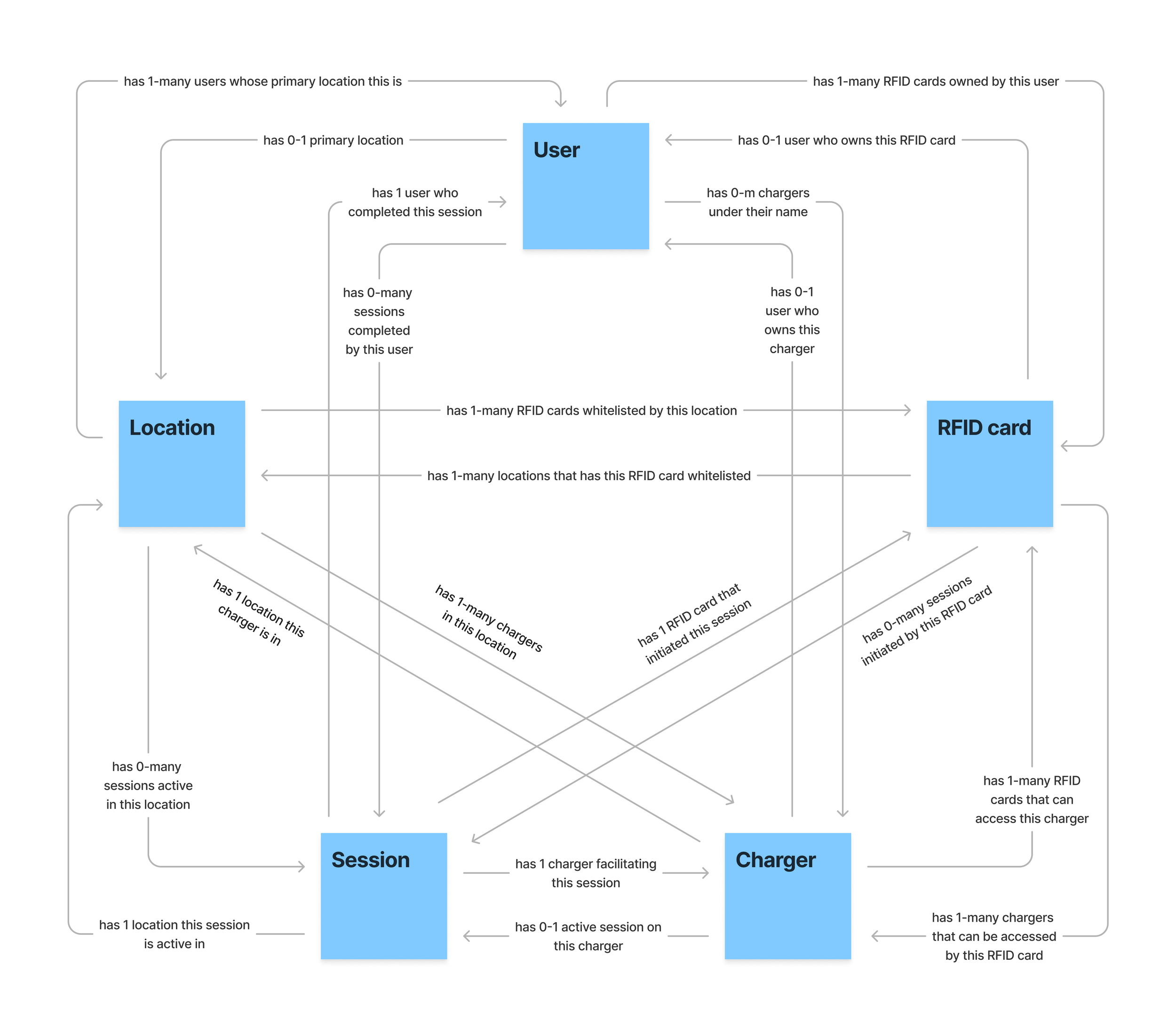
System Model: To visualize and explore the primary relationships between objects, I created a system model. This prompted discussions around core functionalities of our product, such as whether or not users are tied to locations, or if the same RFID card can be used to initiate multiple charging sessions simultaneously, etc.

CTA Discovery: With the CTA Discovery table, I brainstormed calls-to-action that can be performed on each core object in the system by different user roles. Paring down from a larger list, I prioritized the most essential CTAs for phase one of the project. This table would later also serve as an important point of reference and a pseudo-checklist for me during the UI design.


Wireframing: Before transitioning from ideation to prototyping, I performed competitive and comparative analysis on existing products on the market. The team compiled a mood board from which to draw inspiration. Sketches and wireframes were done quickly as a group to explore layouts and user flows. We involved a few Electrum admins at the end of the process to gather feedback.
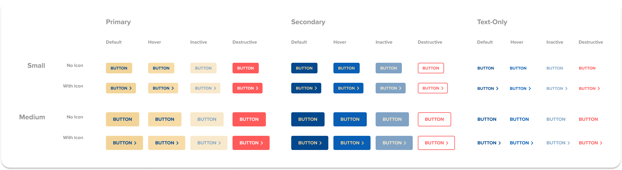

Design system: It was a priority for us to start building a design system, not only to improve visual consistency but also to facilitate a more efficient design process going forward.
With the direction of the interface determined, I got started on designing the UI components and guidelines. I used Electrum’s brand colours of blue and gold as the CTA to add visual weight against white and grey backgrounds. The overall style was clean and minimal to facilitate intuitive interactions.
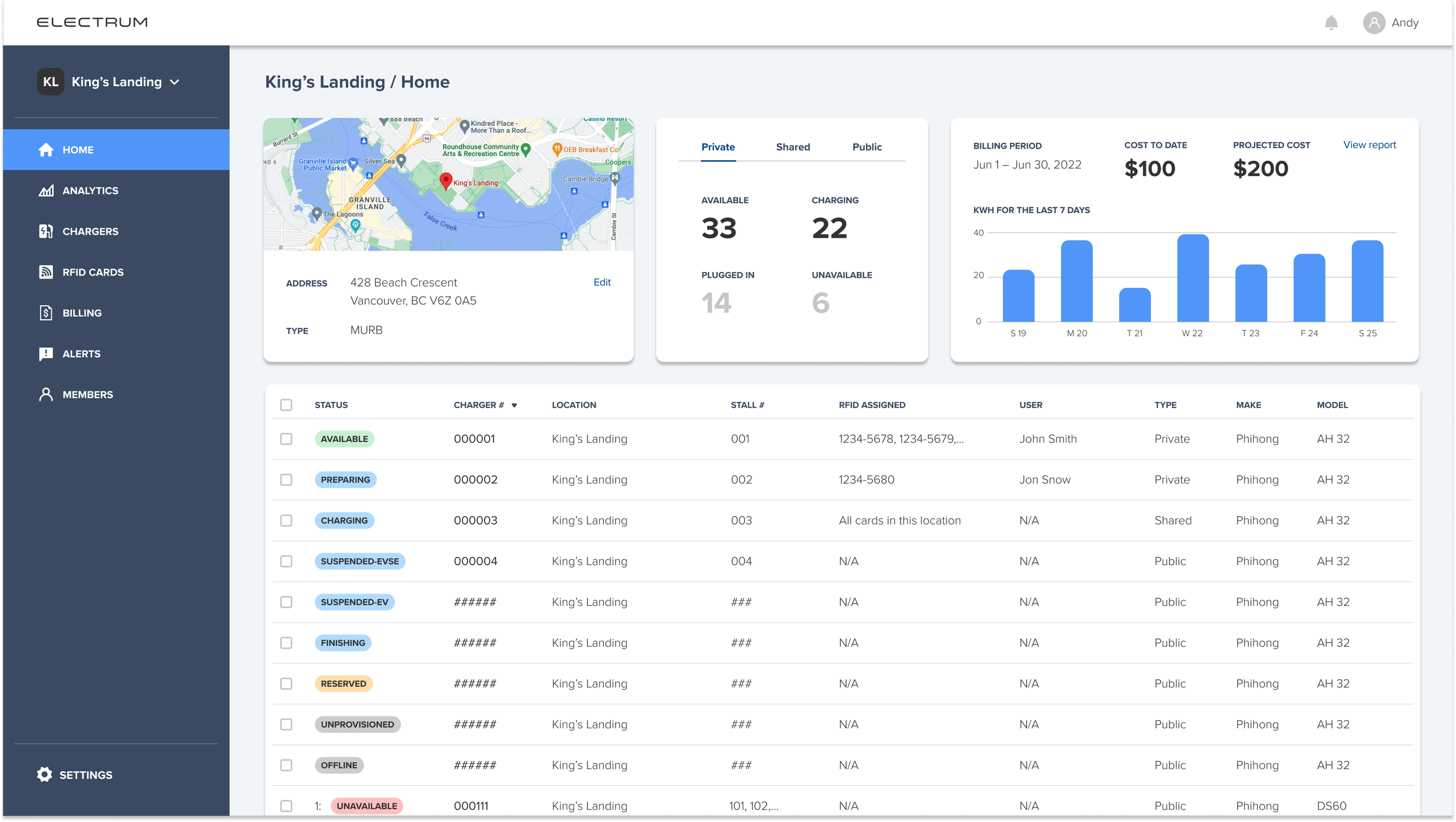
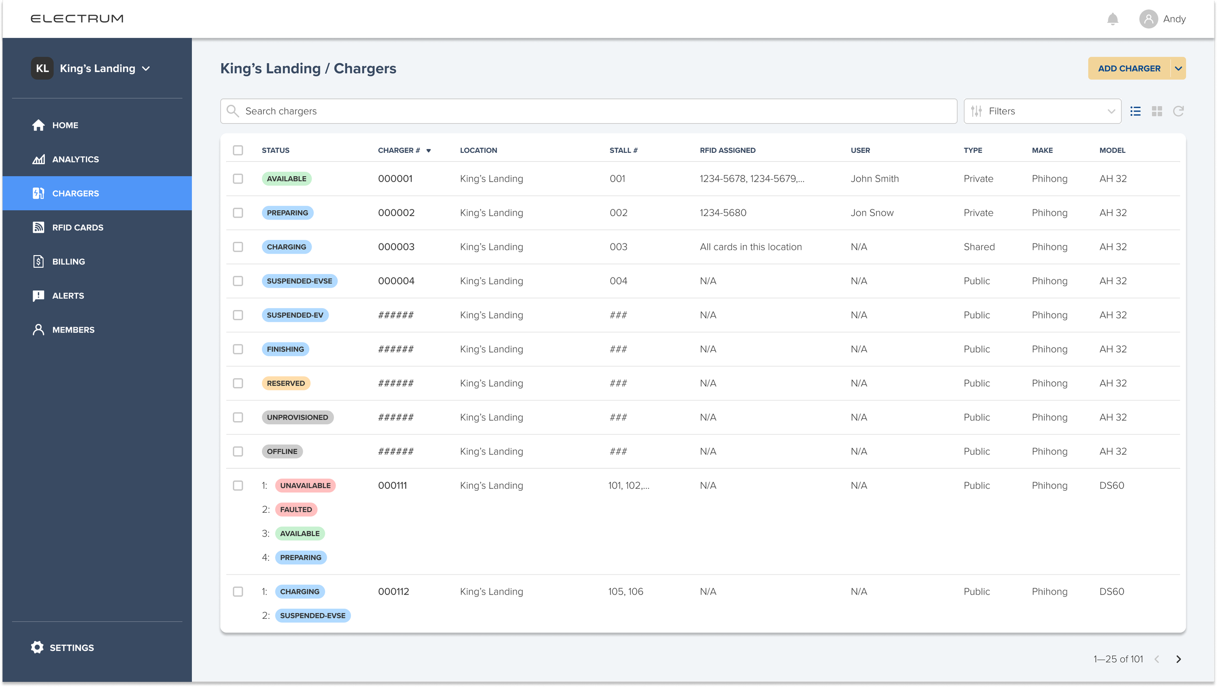


Prototyping: Working closely with developers and other stakeholders, the design, testing, and development were all progressing in parallel. After several iterations, I created a high-fidelity, interactive prototype in Figma. Testing was conducted with Electrum admins.

Launch: With solid strategy and execution, the team successfully launched the MVP on schedule. It immediately made an impact on the business. Urgent customer requests were satisfied and the pressure on Electrum’s admins was alleviated. Further development on this product is still ongoing.
Reflections
Despite our best intentions, projects are seldom given enough time and space. One key area in this project that would have benefited greatly from more resources was the user research and testing process. Even though the team conducted interviews with key stakeholders of the project and received valuable insights to inform our design decisions, it would have been ideal to have combined a wider array of research methods such as desirability studies, surveys, and A/B testing. All things considered, I thought the team performed well given the constraints we were under.
The project’s highlight for me was the adoption of the OOUX methodology. Although I had followed it for some time, this was my first opportunity to convince the team to use it in practice. OOUX helped us break down the complex system we were building into intuitive, explicit components that matched our users’ mental models of the real world. It also allowed the team to share a united understanding of the backbone of our product, which guided us throughout the entire development process.